logo
logo
logo

CASE STUDY APP

Techcombank

Techcombank

Techcombank

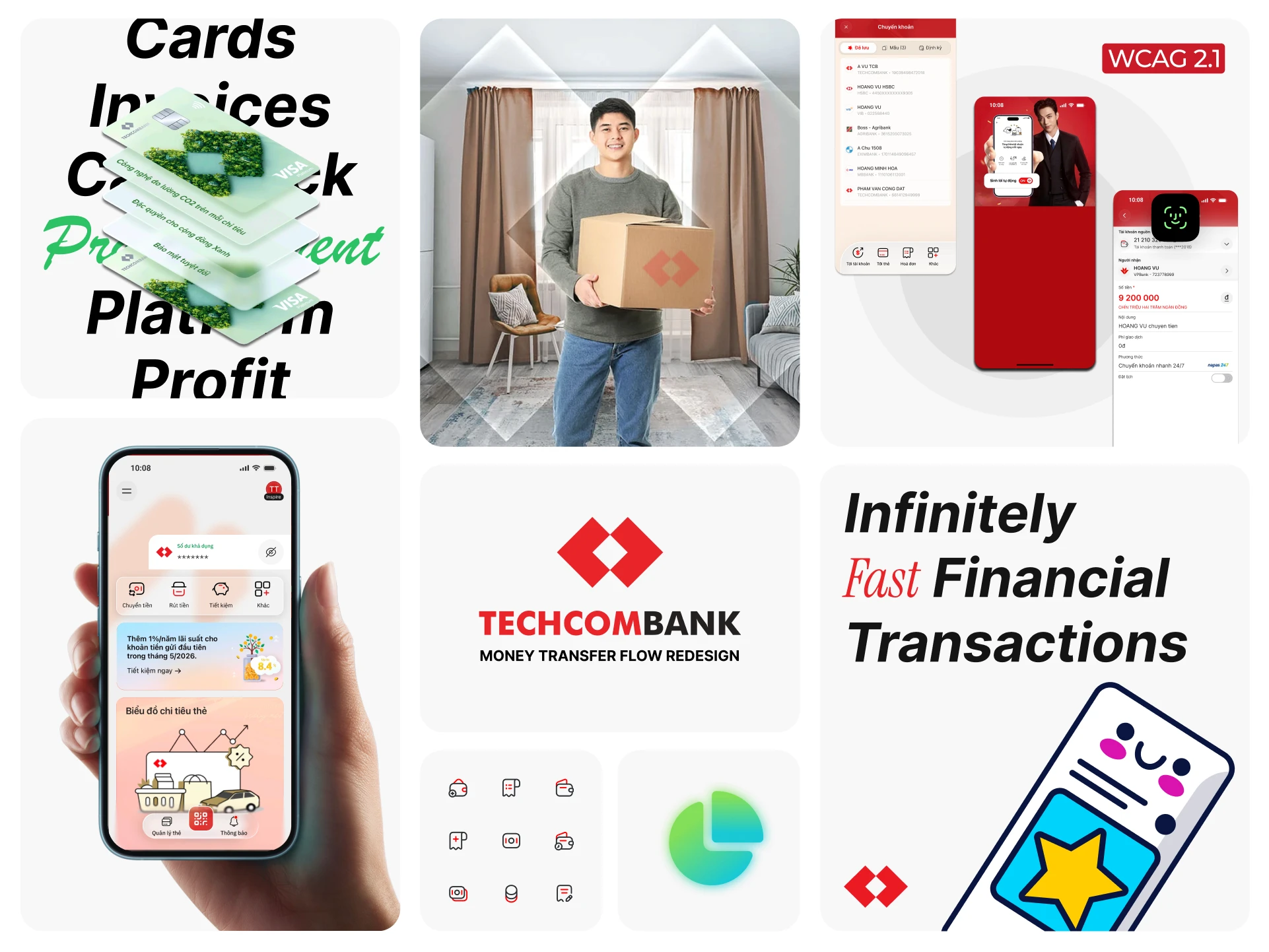
Society keeps evolving. People keep growing. The apps we touch every day — inevitably, must evolve too. When the world outside is already full of noise, the place that holds your assets must be a place of calm, speed, and absolute control. The question posed: How can a financial product expand its service ecosystem while preserving its foundational values — fast, clear, and reassuring?

Society keeps evolving. People keep growing. The apps we touch every day — inevitably, must evolve too. When the world outside is already full of noise, the place that holds your assets must be a place of calm, speed, and absolute control. The question posed: How can a financial product expand its service ecosystem while preserving its foundational values — fast, clear, and reassuring?

COMPANY

TECHCOMBANK

ROLE

PRODUCT DESIGN (SOLO)

TIME

JAN - APR 2026

STACK

FIGMA / JTBD

cover-image

Scope: Home Screen App
Method: UX Research, AI Analyst, Competitive Benchmark, UX Audit, System Design.

The answer does not lie in a shinier layer of graphics. It lies in reestablishing the balance among three pillars:
User — Speed & Focus: Reduce cognitive friction, return space to primary tasks. Users complete their goals through natural reflex, not by "searching around."
Business — Growth & Conversion: Restructure display space into a layered architecture, allowing new services and cross-sell campaigns to reach users in the right context — sustaining the conversion funnel without creating interface clutter.
Tech — Stability & Scalability: Build a durable interface architecture capable of integrating a wide range of future services without dismantling the existing structure or degrading performance.
That is why this design was created.

That is why this design was created.

1. Research & Insights

Since this is a concept project, I did not have access to internal data such as heatmaps, funnel analytics, or session recordings. Research was built from three complementary signal sources: industry data, competitive benchmarking, and public review analysis.

The goal was not to replace internal analytics, but to identify recurring friction patterns and validate direction before development. Each source was used for its proper role: Industry Signal provides macro context, Benchmark identifies users' default expectations, and Review Analysis pinpoints real breakpoints in the current experience.

1.1. Industry Signal

According to publicly available data from the State Bank of Vietnam and The Connected Consumer report, from 2021 to 2025, mobile channel transactions grew at an average of 73.32% per year by volume and 52.55% per year by value. QR transactions alone grew at 106.24% per year by volume.

These figures do not directly point to problems on the Screen. But they establish something important: mobile banking has become a core behavior, no longer a supplementary one. That means users are no longer "trying out the app" — they use it as a daily habit, and their expectations around speed, stability, and predictability have risen accordingly.

This is the context for asking: If mobile banking is a core behavior, is the Home Screen designed for frequent users — or is it still serving first-time users?

1.2. Competitive Benchmark

Benchmarked 10 popular banking and fintech apps in Vietnam, focusing on four core patterns: bottom navigation, card balance, hide/show money, and transaction list.

The goal was not to copy, but to identify interaction patterns that have become users' default expectations — things that, if broken, cause friction, but if preserved correctly, create a sense of familiarity and trust.

What the benchmark revealed beyond the obvious:

First, how apps handle the trade-off between density and clarity varies significantly. One group (MoMo, ZaloPay, etc.) prioritizes density — more shortcuts above the fold to increase discoverability. The other group (Cake, Timo, etc.) prioritizes clarity — fewer items but each with greater visual weight and clearer context. Neither approach is wrong, but they serve two different mental models. The question is: which mental model is Techcombank serving, and does the current Home Screen reflect that?

Second, QR is handled similarly across most apps — all placed in the bottom bar. The difference is some banks choose 3 items; some choose 5. This is an interesting detail that directly affects time-to-QR.

Third, marketing banners in most apps appear immediately below the balance or the first shortcut. This creates a common but not necessarily correct pattern: users haven't yet confirmed their financial status before being pushed into advertising content. This is a point where Techcombank can do things differently — not for differentiation's sake, but because it better serves trust.

Conclusion: Brand differentiation should come from the visual system and experience quality, not from bending basic behaviors. That is the opportunity for Techcombank to position itself at a different tier.

1.3. User Review Analysis

From approximately 1,000 public reviews on Techcombank Mobile's App Store and Google Play, I filtered and identified 153 reviews that directly mentioned UI/UX.

The process included: filtering UI/UX-related reviews, using AI to group keywords and sentiment by initial theme, then manually re-reading representative comment samples for verification. AI here served only as a synthesis support tool, not the final decision-maker.


Category

Count

Avg Rating

Main Description

Experience (UX)

72

2.60 ★

Interactions, usage flows, inconveniences when using the app

Interface (UI)

62

2.52 ★

Design, display, messy old/new interface mixing

Both UI and UX

19

2.84 ★

Mentions both aesthetic and experience flow elements

Two most recurring themes:

Core Function Discoverability: Users cannot find the features they need. A typical review: "Searched forever and still couldn't find it." Notably, most of the "lost" features hadn't actually disappeared — they were still there, but buried in the menu bar. This is not a problem of feature quantity, but of information architecture and visual priority.

UI Inconsistency after updates: Many users reported the app "showing new interface today, reverting to old interface tomorrow." This is not just a technical rollout issue — it has trust consequences. When the interface of a financial app looks unstable, users begin to worry about the stability of the service itself. In banking, UI consistency is a trust signal, not merely an aesthetic factor.

Limitations of this data: Reviews are reactive data — people writing reviews are typically in a frustrated or very satisfied state, not representative of the average experience. However, when a theme appears repeatedly across many independent reviews, it is a signal worth investigating, even if its prevalence cannot be confirmed without internal data.

Honestly speaking — when users dislike an app, they simply leave.

2. UX Audit

From the industry data, benchmark, and review analysis, I audited the current Home Screen to see how those signals manifest in the actual interface.

The detailed audit criteria set is in Appendix 8.1.

The goal was not to judge whether the UI looks good or bad, but to identify: where users are looking first, which tasks are mis-prioritized, and what content is creating noise in the main flow.

Key findings:

1. Trust information is not prominent enough. The balance is the information users need to confirm first when opening the app, but it competes for visual weight equally with the shortcut grid and components below. The result is no clear visual anchor — users' eyes don't know where to look first.

2. Core actions and quick actions are mixed together. Transfer and QR, Cards are all sitting in the same shortcut group, but their usage nature is completely different. Transfer is a careful action — requiring information input, recipient verification, amount confirmation. QR and Cards are instant actions — needing quick access, often in time-pressured contexts. When placed at the same priority level, the Home Screen loses behavioral clarity and both task types are served worse than they could be.

3. No Quick Access zone exists. There is no area clearly designed for actions requiring speed.

4. Marketing has no position in the hierarchy. Banners and offers still need to appear — they just need a defined place.

Conclusion: The problem with the Home Screen does not lie in individual visual elements. It lies in the fact that information layers haven't been clearly assigned roles, forcing users to do work that the interface should be doing for them.

3. Problem Definition

The core problem lies in information layers appearing simultaneously without being tiered according to users' actual intent.

In other words, the current Home Screen is optimized to display many things, but not optimized for priority order when users need to complete a task.

Four information layers that are currently blended:


Layer

Role

Consequence when not tiered

Trust

Balance, account status

Users spend extra time confirming financial status, creating anxiety before beginning a transaction

Core

Transfer, payment, top-up

Users must scan the entire shortcut grid to find the main action, increasing cognitive load and reducing task completion

Quick

QR, card, notifications

Speed-critical tasks are treated like regular shortcuts, increasing time-to-action exactly when users are most pressured

Growth

Banners, offers, products

Marketing appears before users have finished orienting, turning suggestions into interruptions

Three specific problems:

1. Information Layers Not Clearly Differentiated. When too many components share the same hierarchy level, users must determine for themselves what the primary information is, what the primary action is, and what is secondary content. This is cognitive work that the interface is transferring to the user instead of handling itself.

2. High-Frequency Actions Competing for Attention. QR, transfer, card — all important, but not the same usage nature and not the same decision-making context. When placed at equal priority, the Home Screen doesn't serve either group well.

3. Business Content Has No Position in the Hierarchy. Marketing should not be removed from Home — it is part of the business model. But it needs a clearly defined position in the hierarchy. If it appears too early or wedges between trust information and core actions, marketing becomes friction instead of opportunity.

4. Design Strategy & Solution

Layered Attention System

The design strategy does not start from "make the interface look newer," but from redefining the role of each information layer and the order in which they are seen.

I reorganized the Home Screen according to a Layered Attention System — each layer has a clear mission and does not encroach on another:

┌──────────────────────────────┐
1. Account Identity         Establish personal context
├──────────────────────────────┤
2. Balance / Trust Anchor   Confirm financial status
├──────────────────────────────┤
3. Core Transaction Area    Lead into primary transactions
├──────────────────────────────┤
4. Quick Access             Instant task shortcuts
├──────────────────────────────┤
5. Growth Content           Business space
└──────────────────────────────┘
┌──────────────────────────────┐
1. Account Identity         Establish personal context
├──────────────────────────────┤
2. Balance / Trust Anchor   Confirm financial status
├──────────────────────────────┤
3. Core Transaction Area    Lead into primary transactions
├──────────────────────────────┤
4. Quick Access             Instant task shortcuts
├──────────────────────────────┤
5. Growth Content           Business space
└──────────────────────────────┘
┌──────────────────────────────┐
1. Account Identity         Establish personal context
├──────────────────────────────┤
2. Balance / Trust Anchor   Confirm financial status
├──────────────────────────────┤
3. Core Transaction Area    Lead into primary transactions
├──────────────────────────────┤
4. Quick Access             Instant task shortcuts
├──────────────────────────────┤
5. Growth Content           Business space
└──────────────────────────────┘

4.1. Account Identity — establish context, don't steal the spotlight

The first layer helps users confirm they are in the right account and the right personal space.

Design move: Add avatar and account status at the top area, but reduce visual weight so this zone does not compete with the balance. Account Identity plays a context-setting role — not the main focal point.

4.2. Balance / Trust Anchor — help users control their financial status

The balance is the trust anchor of the Home Screen. Users open a banking app first and foremost to confirm: is my financial situation okay or not?

Design moves:

  • Increase breathing space around the balance module so the balance becomes a clearer visual anchor

  • Expand the hide/show button touch target to a minimum of 54×54px

  • Keep visible, hidden, loading, and error states at the same height to prevent layout shift

Rule: Balance doesn't just need to be more prominent — it needs to be more stable. Layout shift in the balance zone is not just a UX issue; it can cause users to misinterpret that the account has a problem. The stability of the balance zone is an implicit trust signal.

4.3. Core Transaction Area — for actions requiring review and confirmation

Core Transaction is where primary tasks begin: transfer, payment, top-up.

Design moves:

  • Place transfer at the top position in the core transaction group

  • Keep transfer in the main transaction zone, don't move it down to the bottom action

  • Consolidate secondary tasks into an expandable menu to reduce scan load

  • Expand touch targets to a minimum of 48×48px and increase spacing between functions

Rule: Transfer is a careful action — users need to enter information, verify the recipient, and confirm the amount. It needs a clear, focused, low-noise operation zone. Placing transfer in the same group as QR is placing two behaviors of completely different natures into the same mental frame, which will disrupt the operational mindset.

4.4. Quick Access — for actions requiring instant opening

Quick Access is for tasks requiring immediate reflex: QR, cards, notifications.

Design moves:

  • Move QR, Cards, and Notifications to the bottom action area

  • Limit the bottom action to three items to avoid turning it into a second shortcut grid

  • Use icons to reduce ambiguity

  • Ensure minimum tap area for each item

  • Notification badge must not cover the label or reduce icon recognizability

Rule: Instant actions are used frequently. This is when users are least patient and least tolerant of friction. Placing them in the bottom action with adequately large touch targets directly affects the perceived speed of the entire app.

QR — instant action, needs fast access in time-pressured payment contexts.

Cards — needs quick access to check, manage, or lock/unlock a card.

Notifications — related to balance changes, transactions, security alerts, and financial status.

4.5. Growth Content — visible but non-interrupting

Marketing, offers, and financial products still need to appear on Home. The issue is not whether they appear, but where they appear in the user's attention journey.

Design moves:

  • Place banners/offers after the utility layer

  • Limit banner height to avoid disproportionate visual weight

  • Secondary campaigns go into a carousel or separate area

  • Consider allowing dismissal if appropriate to content strategy

Rule: Once users have seen their balance and finished orienting themselves, marketing will be received as a suggestion rather than an interruption. The same banner, placed correctly, can increase CTR; placed incorrectly, it will increase dismiss rate and reduce trust in the entire Home Screen. — This needs further validation.

5. A/B Direction

From the same layered strategy, I developed two concept directions with two different degrees of change.

Option A: Controlled Modernization

Option A preserves the familiar mental model. Users still see the balance at the top, primary tasks below, quick access at the bottom — exactly where they are accustomed. Changes occur at the priority and spacing layer, not the layout layer.

Key changes:

  • Balance module gets expanded breathing room and increased prominence to become a clearer visual anchor

  • Core transaction hierarchy is cleaned up, with transfer at the top

  • QR, Cards, and Notifications are moved to the bottom action with larger touch targets

  • Marketing is pushed below the utility layer: still visible but not inserted into the main flow

Trade-off: Moderate visual impact. To someone looking from the outside, A might look more like a "tidied up" version than a full redesign. But this is an intentional trade-off — reducing friction without making the app feel unfamiliar to existing users.

Option B: Card-Based Modernization

Option B maintains the same layered logic but makes stronger changes to how the top of the screen is organized. Account identity and the balance module are packaged into a large card, creating a personal financial dashboard feel.

Advantage: Higher visual impact, more premium feel, closer to a modern fintech experience.

Trade-off: The large card takes up more space, potentially pushing core transactions and quick access further down — increasing scan load, learning cost, and support ticket risk in the early post-release period.


Decision Matrix


Final Direction: Choose A

I chose Option A because the goal of this project is to reduce everyday friction, not to rebrand.

For a banking product with a large user base, fewer but correctly placed changes typically deliver higher value than strong changes that require users to relearn. Learning cost is not just a UX issue — it directly translates into support tickets, drop-offs, and negative reviews in the weeks following release.

B would be the right choice if Techcombank had plans for a comprehensive rebranding. But that is a different project, with a different objective, a different risk profile, and a different validation plan.

6. Validation & Rollout

Validation Strategy

Before A/B testing, baseline must be measured from the current version to avoid evaluating results based on personal impressions. Without a baseline, there is no real A/B test — just two designs being evaluated by eye.

Usability testing conducted with 8–10 users, including frequent users (using the app daily) and less frequent mobile banking users (fewer than 3 times per week). These two groups typically have different failure modes — frequent users are affected by position changes; infrequent users are affected by discoverability.

Primary tasks:

  • Check balance

  • Perform a transfer

  • Open QR for payment

  • Find an offer

  • Check notifications

Key Metrics


Metric

Role

Target

Baseline needed?

Owner

Time-to-QR

Primary metric

Decrease vs. baseline

Yes

Research / Product

Time-to-transfer

Primary metric

No significant increase

Yes

Research / Product

Task success rate

Primary metric

≥90% on core tasks

Yes

Research

Tap accuracy

Primary metric

Increase on main controls

Yes

Research / Design

Familiarity score

Guardrail metric

≥7/10 or no sharp drop

Scale must be established first

Research

Banner CTR

Business metric

No decrease vs. baseline

Yes

Product / Growth

Support tickets

Health metric

No increase in "can't find feature" reports

Yes

Support / Product

Note on metrics: Targets above are directional, not commitments. Actual baseline will determine specific success thresholds. If baseline has not been measured, the first step of rollout is not to deploy — it is to measure baseline.


Rollout Strategy

The redesign is rolled out layer by layer to reduce risk and maintain controlled rollback capability:

  1. Visual Foundation: spacing, hierarchy, typography

  2. Balance Module: touch target, state management, error handling

  3. Quick Access: QR, Card, Notification repositioned

  4. Marketing: repositioned after utility layer

Each phase has a decision gate. If metrics worsen, rollback the specific phase — not the entire release. This allows the team to learn incrementally rather than losing all data when an issue occurs.

Why Option A balances rollout better:

  • Product: Reduces friction without disorienting existing users

  • Engineering: Clearer scope because changes are layer-by-layer, not a complete flow overhaul

  • Marketing/Growth: Still has surface area for campaigns, measured by performance after correct contextual placement

  • Brand: Still has room to evolve the visual system without disrupting operational patterns

  • Support: Reduces risk of increased "can't find feature" tickets

Accepted trade-off: Sacrifice some visual impact in exchange for behavioral clarity, lower learning cost, and safer rollout.


  1. Reflection

Redesigning a product like Techcombank does not start from "How do we make the interface look newer?" — it must start from "How do we return control to the user?"

Designing a bank's Home Screen is essentially the process of establishing a strict Attention Hierarchy. The balance builds trust. Transfers demand focus. Scanning QR requires reflexive speed. Marketing needs timing. If all these information layers are placed at equal level, the product will inadvertently shift cognitive burden to the user and break the experience flow.

What this project did not accomplish — and I need to be honest about that:

All research was based on external signals. No heatmaps, no funnel analytics, no session recordings. That means some decisions — for example, the specific position of QR or the optimal banner height — remain educated assumptions, not validated conclusions. The next mandatory step is usability testing with real users and measuring baseline before committing to any changes.


If I had more time, I would do two things:

(1) directly interview 5–8 users to understand their actual mental model when opening the app — not to confirm hypotheses, but to find things I haven't thought of;
(2) build an interactive prototype to test actual time-to-QR and time-to-transfer, rather than evaluating by eye alone.


Remaining risk:
Option A trades visual impact for behavioral clarity and safer rollout. If the business's actual objective is rebranding — creating a visibly renewed feel for users and the market — then A may not be strong enough to create that perceptual shift. In that case, B is the correct starting point, paired with a completely different validation plan and rollout strategy. But if the objective is to reduce daily friction and protect existing user habits, A remains the more appropriate choice — and that is the objective this project was defined around from the start.

What I am most certain of after this project: Business expansion and UX smoothness can absolutely coexist — if we respect users' focus. The space for brand evolution or product expansion roadmap should never become an obstacle that slows down essential tasks.

A successful redesign is one that becomes invisible. Users don't pause to remark "The app looks so new" — they simply enter the transaction flow with a single impression: "Still Techcombank, but everything flows better."

detail-image
detail-image
detail-image
  1. Appendix: Implementation Notes

8.1. UX Audit Criteria

Before proposing the redesign, I used the criteria below to evaluate how the current Home Screen distributes user attention.


Criteria

Key Question

Information hierarchy

Do users immediately recognize the most important information?

Task priority

Are Transfer, QR, Card, and Notification prioritized according to their usage behavior?

Visual weight

Are Balance, shortcuts, banners, and marketing competing for the same level of attention?

Touch target

Are quick-access actions easy to reach and large enough to tap?

State clarity

Are loading, hidden, offline, and error states clear and stable?

Business placement

Does marketing appear in the right context, or does it interrupt the main flow?

8.2. Component Rules

From the audit, I translated each information layer into a specific rule so each component serves one clear primary role.


Component

Rule

Account Identity

Provides personal context without stealing the spotlight.

Balance Module

Acts as the trust anchor: prominent, stable, and free of layout shift.

Core Transaction

Treats Transfer as a careful action that needs a clear, low-noise transaction area.

Bottom Action

Treats QR/Card/Notification as instant actions: easy to tap, easy to recognize, limited to 3 items.

Growth Content

Remains visible but does not sit between Balance and Core actions.

8.3. Key States & Edge Cases

These states are prioritized because they directly affect perceived stability and trust in a financial product.


Area

Must Handle

Balance

Visible, hidden, loading, offline, error, overly long balance amount

Bottom Action

Badge must not cover label, 48×48px tap area, 150–200% font scaling

Core Transaction

Clear disabled/loading states, with a next action when an error occurs

Growth Content

One primary banner; secondary campaigns moved to carousel or a separate area

8.4. Metrics

These metrics help verify whether the redesign actually reduces friction, rather than only making the interface look cleaner.


Goal

Metric

Faster QR access

Time-to-QR, QR launch rate

Transfer does not become slower

Time-to-transfer, task success rate

More stable Balance experience

Tap accuracy, hide/show usage, balance error rate

Marketing does not create noise

Banner CTR, dismiss rate

Safer rollout

Familiarity score, support tickets

Note: Baseline should be measured before Phase 1. Targets should only be finalized after current performance data is available.

8.5. Handoff Summary

To make sure the redesign does not stop at Figma, each team needs the right information for its part of the rollout.


Team

Needs

Product

Problem framing, metrics, rollout phases

Engineering

Component states, edge cases, analytics events

Research

Usability tasks, baseline plan, guardrail metrics

Marketing

Banner placement rules, CTR/dismiss tracking

Support

Key changes, FAQ, ticket categories to monitor

8.6. Implementation Summary

This table summarizes how the strategy in the main case study translates into concrete implementation decisions.


Strategy

Execution

Trust Layer

Stable Balance, no layout shift

Core Action Layer

Transfer is easy to find and not mixed with quick actions

Instant Access Layer

QR/Card/Notification placed in the bottom action area

Growth Layer

Banner remains visible but does not interrupt the main flow

Controlled Modernization

Layer-by-layer rollout with baseline, metrics, and rollback triggers

Sources / References

  • Public data from the State Bank of Vietnam on digital channel and QR transaction growth

  • The Connected Consumer report on digital user behavior

  • Approximately 1,000 public reviews from the App Store and Google Play, filtered to 153 UI/UX-related reviews, analyzed with AI-assisted synthesis and manually verified

  • Competitive benchmark with 10 popular banking and fintech apps in Vietnam

Create a free website with Framer, the website builder loved by startups, designers and agencies.